Composition in photography: symmetry and asymmetry
Symmetry
Composition in photography is one of fundamental theme. A photographer should think about how viewers “read” an image. It is important to think haw to organize elements within their frame.
For centuries people consider symmetry is a sign of beauty. It is not surprising, as symmetry is inherent in our nature. People think of symmetric figure as an object, it is easier to perceive and remember. In addition, there is research proves that people like symmetric composition more than asymmetric.
So, if you want people easily perceive and remember your object (photograph, design), you should use simple figures and forms and symmetry.
In the other hand, if you want people stop to look at the object, you had better to use more complex combination.
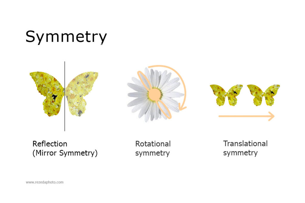
Reflection (Mirror Symmetry) – mirroring of identical elements around an axis (e.g. butterfly).
Rotational symmetry – rotation of identical elements around a common center (e.g. sunflower).
Translational symmetry – arrangement of identical elements in different areas, the transfer can be in any direction and at any distance, but always with the base orientation preserved, that is, it is a parallel transfer.

Composition in photography: Asymmetry and Balance

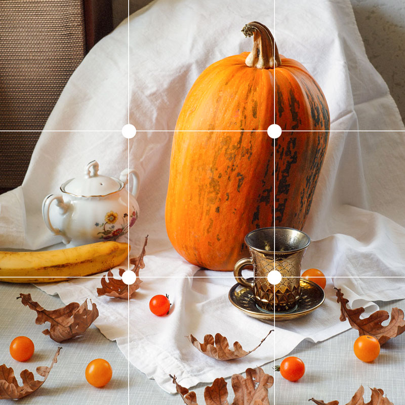
When we use asymmetry, it is about Rule of thirds (frame is divided into 9 parts, object is placed on point of intersection of lines) or Golden ratio. So, if we use such principles, we have to balance composition. It means, you should measure visual weight of object. Thing of it like it is about balancing on scales – right and left sides of a picture needs balancing. Balance – is an important part of composition in photography.
- Food Photography explained | Helios 44m Canon 5D Mark II | One Light full process
- Action packed Year’s Eve Movies
- How to install Magic Lantern on Canon
- WHY PERFECTIONISM IS BAD FOR ARTIST
- How to Draw Realistic Lips tutorial step by step